Project overview
Global Nest Family is an international surrogacy and IVF agency with roots in Norway. The website needed to serve a sensitive, high-trust service category where users are often comparing destinations, trying to understand complex medical and legal paths, and looking for reassurance before they ever submit an inquiry.
This project was a redesign of an existing website. The goal was to improve the user experience, clean up the visual direction, and restructure the page flow so visitors could move through the content more clearly. The final scope included 12+ pages, including the homepage, three program pages, destination pages for Mexico, Ukraine, Georgia, Armenia, and Thailand, plus blog, about, and contact pages.
Because the site already had content and search value, the work was not only about design. Existing blog posts were migrated carefully to avoid unnecessary SEO loss, while the overall structure was rebuilt to feel more modern, organized, and easier to navigate.
Challenge
The biggest challenge was balancing clarity and volume. In the surrogacy and IVF space, users need a lot of information, but they also need it presented in a calm and structured way. Too little information creates distrust. Too much information without hierarchy creates friction.
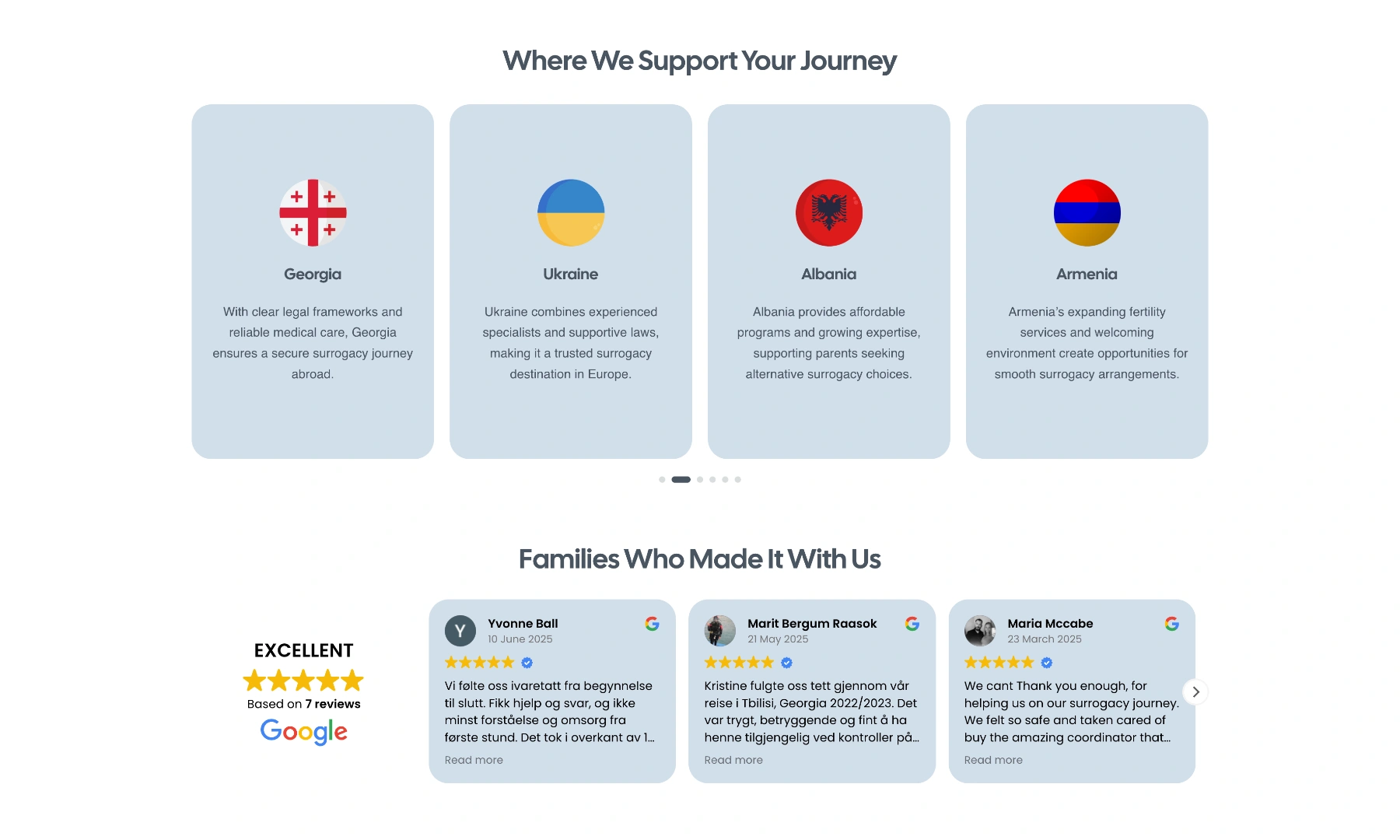
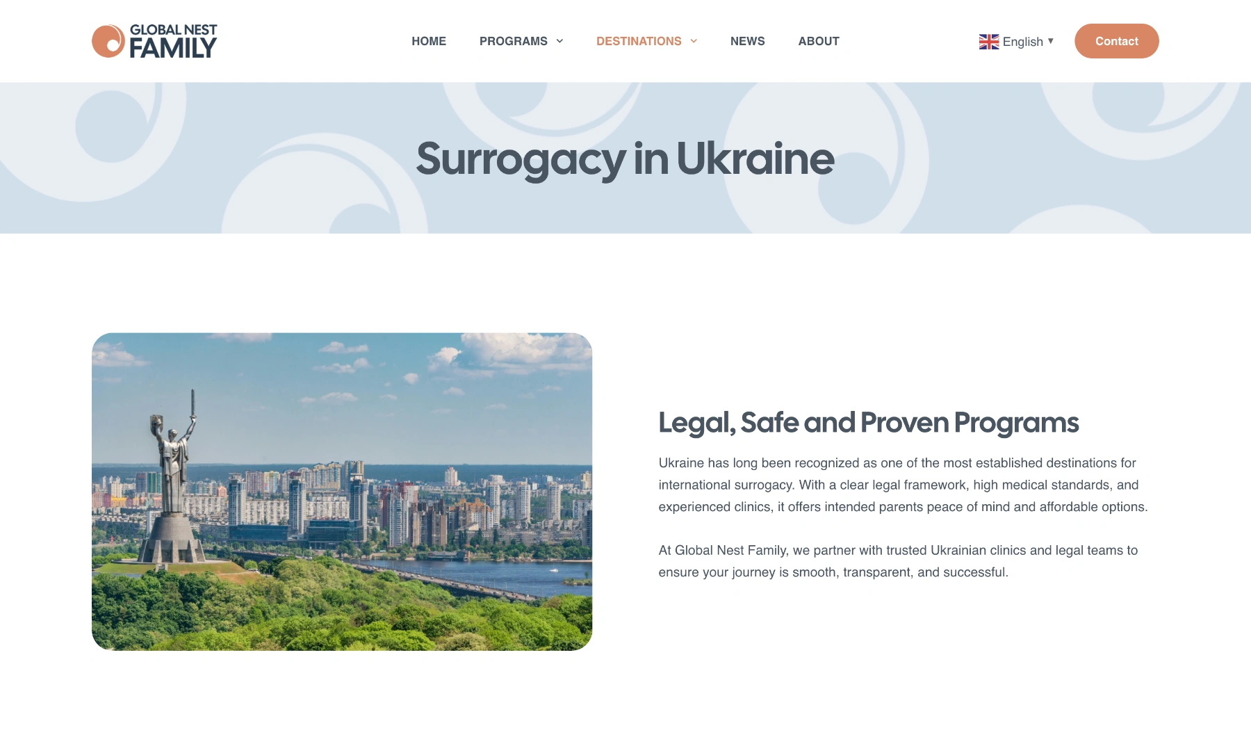
The destination pages were especially important. Each one had to work like its own landing page, covering a specific country with the key information a prospective client would need, while still guiding them toward a fast contact step through an FAQ section and a quick inquiry form at the bottom.
The site also needed to be multilingual across 11 languages, with English as the primary language, which made the page structure even more important. Once a website supports that many language versions, weak hierarchy becomes much more obvious and harder to manage.
Before redesign: legacy homepage hero. This screenshot is included only to show the previous site, not my final design work.
Solution
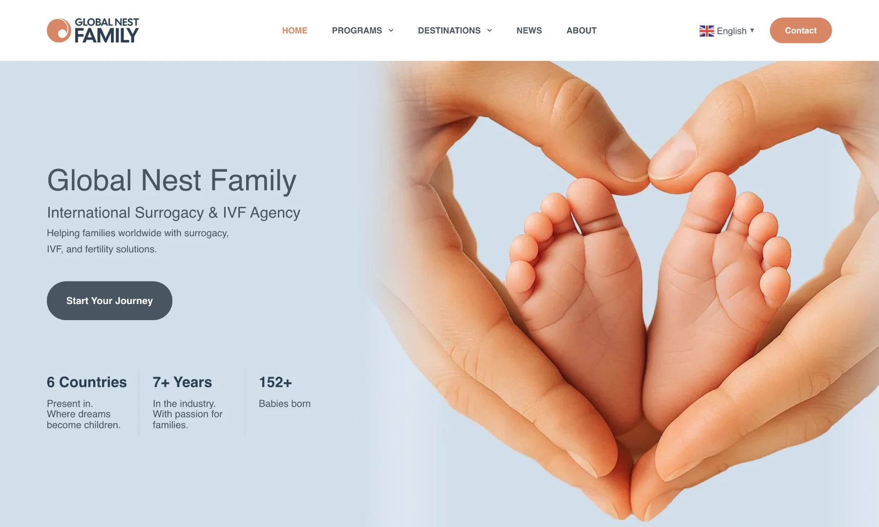
I redesigned the website in WordPress with a stronger focus on content hierarchy, page flow, and visual clarity. The new structure makes it easier for users to compare programs and countries without feeling lost, while still keeping the inquiry path visible throughout the site.
One of the more important improvements was treating the destination pages as true conversion pages rather than generic informational subpages. Each country page is structured to answer the most likely questions early, then move the user toward contact with less friction.
The homepage also became more useful as an overview page instead of just a brand statement. Sections such as the destinations slider and Google reviews widget help support both discovery and trust, which matters in a service category where visitors are making emotionally and financially significant decisions.
The final result is a cleaner, more navigable multilingual website that gives the agency a stronger presentation layer while protecting the content equity that already existed. It is a good example of how a redesign can improve both usability and structure without throwing away the SEO value of an established site.